Bento Showcase: Bento Grid Layouts for Drupal Views
Bento Showcase is a Drupal module that turns a Views listing into a bento grid: a mosaic of tiles in different sizes, where a lead story or product takes a large tile and the rest fill smaller ones around it. Every tile shows its image in an image style made for its shape, and optional filter tabs switch between categories without reloading the page.
Bento Showcase is available on drupal.org for Drupal 11.2 and later; the project page lists the current release.
Why a bento grid
A page of equal cards gives every item the same weight. That suits a search results page, but not a homepage, a section front or a product range, where some items matter more than others and the page has a few seconds to say so.
A bento grid gives a listing a visual hierarchy. The lead item takes the largest tile, a second tier takes tall or wide cards, and the rest fill small tiles. More items fit above the fold than in a single column, and the layout still reads as designed rather than as a feed.
Common bento layout challenges and how Bento Showcase solves them
Bento layouts are common in design mock-ups and less common on content-managed sites, because the content does not behave like the mock-up. Bento Showcase was built around five problems that appear once real content arrives.
Images are cropped or distorted
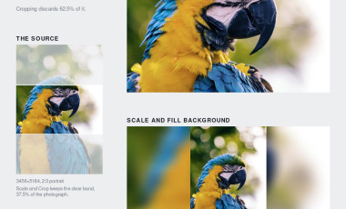
A 2×2 tile, a tall card and a wide card need images of three different proportions. With one image style per listing, most tiles show a poorly cropped image. Bento Showcase renders each image in the style made for its tile's shape: small, wide, tall or big. The four shipped styles use the Image Scale and Fill Background effect, which keeps the whole image and fills the rest of the tile from a blurred copy, so faces, logos and text in images are never cut off.
The grid breaks when the number of items changes
A layout designed for nine items has holes when a category has three. Bento Showcase rearranges any tab with fewer items than the layout holds: one item becomes a full-width banner, two become a pair, three become a hero with two companions, and four or more use a five-column template chosen by the shapes of the images.

The page jumps
Grids arranged by JavaScript after the page loads move content under the reader, and tabs that swap in shorter or taller content push the rest of the page up and down. Bento Showcase works out every tab's layout on the server. On wide screens it reserves the height of the tallest tab, so switching tabs changes the cards but not the page around them. On the fifteen test pages used during development, measured layout shift on load stayed below 0.015 at desktop, tablet and phone widths; Google counts anything under 0.1 as good.
Custom grids often fail to meet accessibility requirements
A grid of clickable tiles built for a single campaign rarely gets keyboard support or screen reader testing. The module's tabs and cards were built to established patterns and are described in the accessibility section below.
Every new layout is a development project
The module ships ten layouts, and a developer adds another by writing a few lines of YAML. The module checks every layout and refuses one that would leave a gap.
Use cases of Bento Showcase Module
The layouts fall into three groups: editorial layouts with a large lead tile, product layouts with a hero beside smaller tiles, and spotlight layouts with a banner or two large heroes. The filter tabs turn one grid into a browsable section.
| Site | What the grid shows | Suggested layout | Tabs |
|---|---|---|---|
| News and media | Latest stories, a section front | Editorial mosaic | One per section |
| Research and policy portals | Publications, evaluations, blog posts | Editorial compact or Adaptive | One per content type or topic |
| Universities | News, events and research highlights | Magazine spread | News, Events, Research |
| Government and public sector | Announcements and services | Editorial compact | One per department or theme |
| Nonprofits | Campaigns, stories, reports | Two heroes | Featured, then one per program |
| Retail and product catalogues | A product range | Product showcase or Centered product | One per category |
| Software and B2B | Case studies, resources | Product with feature card | Guides, Case studies, Webinars |
| Events and conferences | Keynotes, sessions, speakers | Spotlight | One per track or day |
| Tourism and hospitality | Destinations, stays, experiences | Spotlight or Magazine spread | One per region |
| Real estate | Listings with a featured property | Product extended | One per property type |
News and media
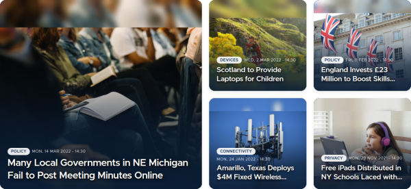
A section front shows nine stories in the editorial mosaic, with the lead story in the 2×2 tile. Marking an article sticky or promoting it puts it in the largest tile, so editors control the lead without touching the layout.
Research, policy and evidence portals
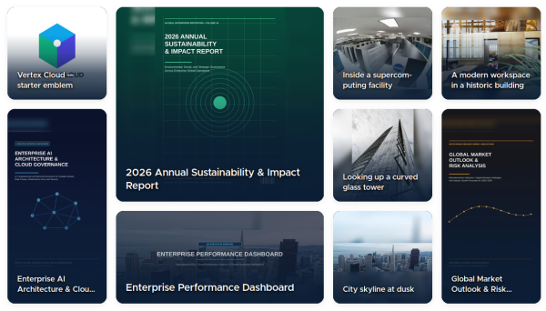
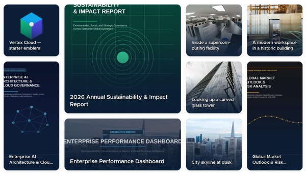
Organizations that publish reports, evaluations and briefs often mix document covers, photographs and charts. The Adaptive layout places each item where its image fits: a portrait report cover goes to a tall tile, a landscape photograph to a wide one. The shipped image styles keep report covers whole, including their titles.
Universities and public sector portals
A homepage block shows six items in the editorial compact or magazine spread layout, with tabs for news, events and research. Accessibility is usually a requirement on these sites, and the tabs and cards were built with it in mind.
Retail and product catalogues
The product layouts put a hero product beside four tiles. The Centered product layout keeps the hero in the middle, which suits a launch or a seasonal collection. Tabs per category let a visitor move between ranges without leaving the page.
Events and conferences
The Spotlight layout gives a keynote or headline session a full-width banner, with three sessions below. A tab per track or day keeps the program on one page.

Choosing a layout
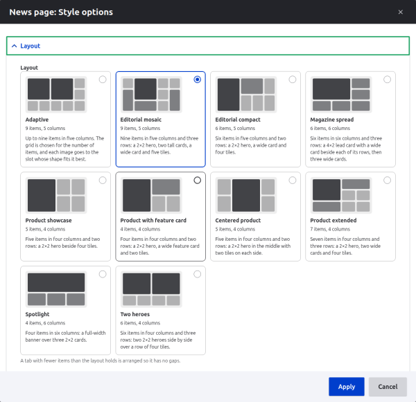
| Layout | Items | Columns | Best for |
|---|---|---|---|
| Adaptive | up to 9 | 5 | Mixed image shapes, varying counts |
| Editorial mosaic | 9 | 5 | Section fronts with a clear lead |
| Editorial compact | 6 | 5 | Homepage blocks |
| Magazine spread | 6 | 6 | A wide lead image, such as a photo story |
| Product showcase | 5 | 4 | A hero product and four others |
| Product with feature card | 4 | 4 | A hero and one promoted message |
| Centered product | 5 | 4 | Launches and collections |
| Product extended | 7 | 4 | Larger ranges |
| Spotlight | 4 | 6 | Events, campaigns, a single headline |
| Two heroes | 6 | 4 | Two equal priorities, such as two campaigns |
Configuring Bento Showcase
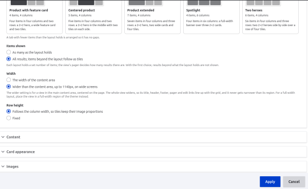
Site builders set everything in the Views interface. The settings are grouped in the order a page is usually planned.
Items shown. As many as the layout holds keeps the designed grid, which suits homepages and blocks. All results adds the remaining items as small tiles below, which suits a full section page.
Width. The width of the content area is the default and fits any theme. Wider than the content area widens the whole view, up to 1140 pixels, on wide screens: useful on a homepage whose content column is narrower than the grid should be.
Row height. By default, rows follow the column width, so tiles keep the proportions of their image styles at every screen size. A fixed row height suits designs where the grid has to line up with other content on the page.
Filter tabs. A tab per category is created from a view field or, with auto, from the first term in Tags, Category, Topic or Section.
- An All tab with every result is shown first, so an item without a category is still reachable. It can be turned off or renamed.
- A Featured tab collects items that are sticky, promoted or marked by a yes/no field. It follows the All tab, ahead of the categories.
- Hide tabs with fewer items than the layout holds keeps thin categories out of the tab row.
- Tab shown first can skip to the first tab with enough items to fill the layout.
- Item counts tell visitors how much each tab holds.
Text background. Titles sit on the image, so the text needs a background that keeps it readable on any photograph.
- Dark gradient: the default, and the safest choice for photographs.
- Light gradient: for lighter, editorial designs.
- Frosted panel: a blurred, translucent panel behind the text.
- Solid bar: a solid band along the bottom of the card, for strict brand guidelines or text-heavy images.
Titles. Titles can be limited to two, three or four lines, or never truncated. With Show the full title on hover and keyboard focus, a truncated title expands over its own image when a visitor points at the card or tabs to it, without changing the size of the card. The heading level can be set so the page outline stays correct under different page headings.
Cards. Corners can be rounded, slightly rounded or square, to match the theme. The category badge can be a pill or plain text, and the date can be shown or hidden.
Images. Each tile shape has its own image style. The shipped styles keep every image whole and fill the rest of the tile with a blurred copy, which suits sites where photographs, report covers, logos and banners with text appear side by side. Site builders can replace any shape's style:
| Choice | What visitors see | Best for | Trade-off |
|---|---|---|---|
| Shipped styles (Image Scale and Fill Background) | Whole images on a blurred background | Mixed content | Blurred bands where an image's shape differs from its tile |
| Core Scale and crop | Edge-to-edge images | Sites with photographs only | Faces, logos and text near the edges can be cut |
| Focal Point and similar crop tools | Edge-to-edge, cropped where editors choose | Art-directed sites | A crop decision per image, and extra modules |
Experience for visitors
- No reload between tabs. Switching category is instant, because every tab's layout is already on the page.
- No page jumps. The grid reserves the height of its tallest tab on wide screens, and nothing is measured or rearranged in the browser.
- Built for every screen. The grid adapts to the space it is given, not only to the screen: below 860 pixels of available width it uses two columns, and below 560 pixels the cards stack in one column, all one shape, each loading the image size that suits the screen. The same view works in a full-width region and in a narrower column.
- Whole images. The shipped image styles never crop, so photographs, logos and report covers show in full.
Accessibility
The filter tabs follow the WAI-ARIA tabs pattern from the W3C's Authoring Practices:
- arrow keys move between tabs, and Home and End jump to the first and last;
- screen readers announce how many items a tab shows when it is selected;
- a tab with a count is read as, for example, "Research (7 items)";
- tabs are at least 44 pixels high, for touch.
Each card is a single link, so a keyboard user reaches it with one press of Tab. Its accessible name starts with the title, then the category and date. The heading level of card titles is configurable, and truncated titles show in full on keyboard focus as well as on hover.
The layout remains usable in Windows high-contrast mode (forced colors): text backgrounds become solid and the selected tab stays distinguishable without color. When a visitor asks their system to reduce motion, animations and tab transitions are turned off.
Accessibility still depends on the content and the theme: images need alt text, and theme colors used through the module's custom properties need enough contrast. The module gives editors and themers the structure; it does not replace an accessibility review of the finished site.
Performance and security
The layouts are calculated once on the server and cached with the view, using Drupal's cache tags and contexts. The browser script is under two hundred lines and has no dependency on jQuery or a layout library. Only the images for the first cards load straight away, and the largest one is loaded first.
Category labels, images and media come only from content the visitor is allowed to see, in the visitor's language. The module adds no pages, routes or permissions of its own; its settings are part of the Views interface.
For developers and themers
- Theming. Themes change colors, spacing and radius through CSS custom properties, or replace the markup with their own single directory component or Views template.
- Rendered content. The module ships a Bento Card view mode and a card component, so entities rendered in a view mode can look like the field cards.
- Custom layouts. A new layout is a few lines of YAML in a module or theme, or a PHP plugin that chooses its slots from the items themselves.
Three guides will cover these topics in more detail. Links will be added here as the guides are published:
- Getting started with Bento Showcase
- Creating custom Bento Showcase layouts
- Using view modes with Bento Showcase
Getting Bento Showcase
Bento Showcase needs Drupal 11.2 or later and the Image Scale and Fill Background module, version 1.1.0 or later, which Composer installs with it:
composer require drupal/bento_showcase
drush en bento_showcase
The shipped image styles need Drupal's default GD image toolkit. On a site using ImageMagick, the status report shows a warning and explains how to choose other styles. Then edit a view and set its format to Bento Showcase.
Links
- Project page: https://www.drupal.org/project/bento_showcase
- Issue queue: https://www.drupal.org/project/issues/bento_showcase
- Image Scale and Fill Background: https://www.drupal.org/project/image_scale_fill
Frequently asked questions on Bento Grid Layouts for Drupal Views
Yes. The grid takes the width of the theme's content area and uses the theme's fonts. Colors, spacing and corners are set through CSS custom properties.
Yes. Choose a featured flag in the view, such as sticky or promoted content, and featured items take the largest tiles.
The tab is rearranged so it has no gaps: two items become a pair, three a hero with two companions.
The shipped image styles never crop. Site builders can choose other styles, which crop if they are set to.
It needs Image Scale and Fill Background, which Composer installs with it and which provides the effect behind the shipped image styles. That effect needs Drupal's default GD image toolkit; on a site using ImageMagick, the status report shows a warning, and site builders choose other image styles.
Yes. Turn off the filter tabs and add the filters to the view as usual.
Yes. Titles, links and category labels come from the translation for the current language.